The following graph shows our gas use by month since 2011.
 |
| Gas use by month for my house. |
You can see we use most gas in January and February when it is coldest. However, there is a lot of variation between years - from about 83 kWh/day in 2014 to 106 kWh/day 2013 - a very cold year. It is very difficult to tell from this data if our home is getting worse or better.
In this chart, each point represents one month as before, but instead of using the month number I have used the average temperature in the month. I got the average temperatures from the Cambridge University weather station. If you don't live in Cambridge and don't have a local source you can get regional averages from the MET Office.
 |
| Gas use by month plotted against average temperature for the month. The line shows the best fit for points where T < 12C. |
Here you can see clearly that below about 12C our gas use is strongly dependent on the temperature and is fairly consistent - most months are close to the best fit line. Above 12C, as it gets warmer in the spring and summer, we use much less. Since we have solar hot water panels, most of the summer gas use is just for cooking.
The cutoff where heating energy use tails off varies from one house to another. As it gets warmer and the difference in temperature to outside decreases your house loses heat more slowly; there comes a point where the 'free' heat gains (such as from using appliances) just balance the rate of heat loss. The balance temperature is lower for homes with good insulation (so low losses), south facing windows and high electricity use such as big TVs or computers (so high gains). When it gets warmer than this your central heating is not needed and when it gets much warmer you have to open the windows to increase heat loss.
 |
| As the weather warms there comes a point where 'free' heat gains, such as from the sun and appliances balance heat losses so you do not need central heating as well. |
The chart above shows that average temperature is a pretty good guide to how much heat you need but heating technology people talk about degree days which are even better as a measure of actual heating demand. Degree days are calculated relative to a cutoff temperature - typically 15.5C which is a typical heat gains/losses balance point. Above this you do not need extra heating so there are zero degree days, but below the cutoff you do need heat - one degree day means 1C below the cutoff for 1 day. So for example, if the external temperature is above the cutoff during the day but 14C for 8 hours during the night, that would be (15.5-14)*8/24 = 0.5 degree days.
The following chart shows my gas heating energy use plotted against degree days - I got the data from government statistics here. This is the UK average rather than local to Cambridge but it is a pretty good fit - better even than the one using average Cambridge temperature and with a sharper tail off at the bottom. However, the best fit line appears to show zero gas use for 2 degree days - this is partly because Cambridge is warmer than the UK average and partly because the cutoff temperature of 15.5C is a bit high for my house.
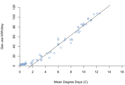 |
| Gas use by month from plotted against degree days (average for the UK). The line shows the best fit for points where degree days > 2. |
With this sort of graph your monitoring data becomes genuinely useful. Unless your heating is very erratic you should get a good fit for energy use against degree days, or temperature. If you find your recent usage is considerably off the best fit line then there has been a real change to your heating pattern and you might want to investigate why - especially if this means you are using more heat then before.
Unfortunately I have only been taking meter readings since about 2011, after we completed energy efficiency improvements to our house. Before then, I only have quarterly bill data, very often estimated. This means there are fewer points and more noise around each point so the best fit is not very good. This chart shows quarterly bill data during 2006 to 2008, before we did energy improvements and other building work on the house. It shows gas use right down to zero degree days and the slope is steeper. This means our balance point was higher and our gas use increased faster with cold weather.
 |
|
Gas use by quarter (using bill data) versus degree days, during 2006-2008 before we installed energy improvements to our house
|
What this shows is you do not need fancy equipment to get useful energy use data for your house - you only need to take meter readings every month or so. (I take them every week). Once we have smart meters this data should be available to you from your energy company so you won't need to actually take readings yourself. However, to make sense of your heating energy use you must have temperature data too - degree days is ideal but average temperature is also good.
By the way, our gas consumption is larger than most households because we have a very large house. Your gas consumption is probably considerably less.
If you live near Cambridge you can come and see my house on an Open Eco Homes tour next Sunday or the following Saturday - book here (the one on Chesterton Road). You can read more about the renovations we did here.
I've just found a much better place to get degree days data from - you can get degree days by day from here.
ReplyDeletehttp://www.degreedays.net